Banco Santander. Santander Smartbank
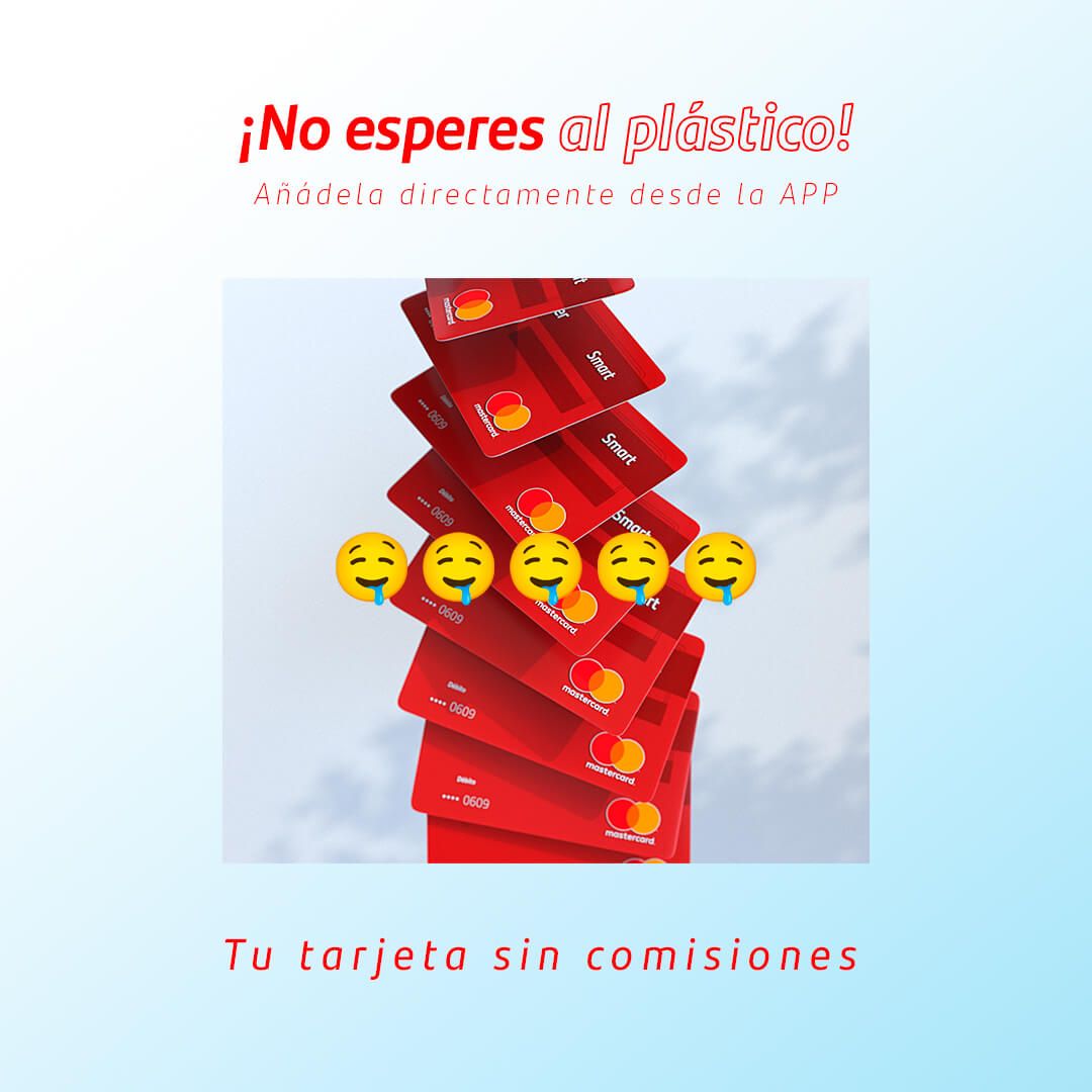
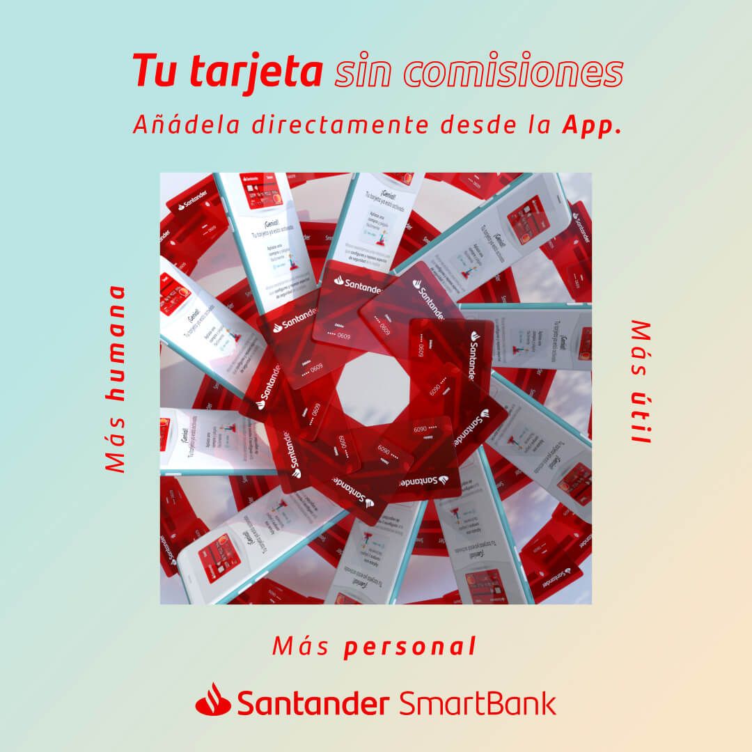
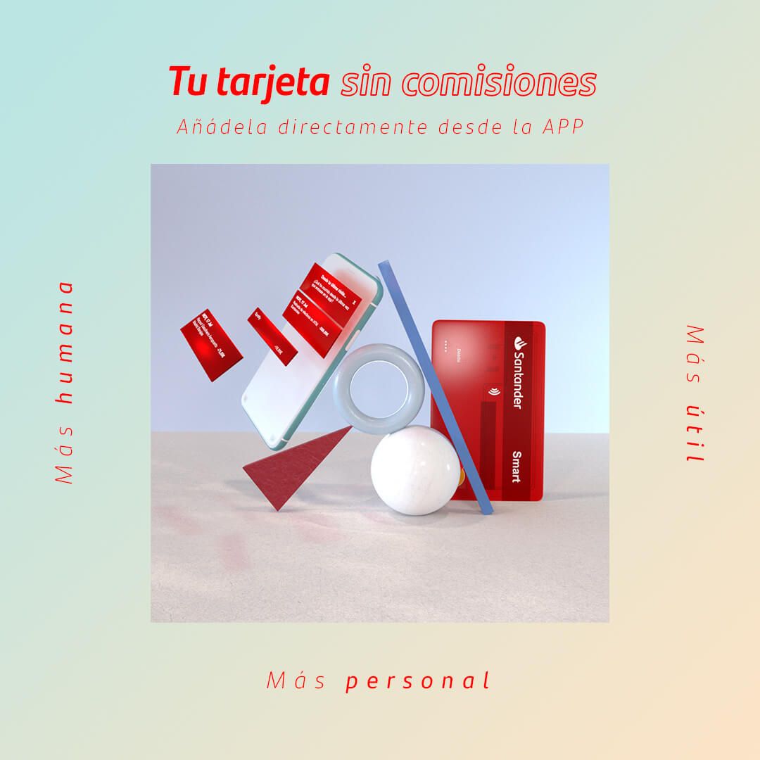
Flying cards, balances, mandalas, and 35 moving boxes. Santander Bank wanted to make a shift in its social media communication. It needed to reach out to younger consumers and captivate them with a fresher tone and a more casual language.
- Client
- Banco Santander
- Agency
- Arena Media
- Motion Graphics
- Michael & Markus

Unique visual and language style
The launch of its new card was the perfect occasion to reflect these changes. We took care of the entire creative concept and 3D production. We worked on pieces with a unique language and visual style, referencing trends that were prevalent in YouTube video comments at that time.

bank stuff. We're good at that
For the visual approach, we chose to emphasize the card, building it from scratch in 3D, and we devoted ourselves to playing with it in a relaxed way without caring about serious matters, bank stuff. We're good at that.


